Wednesday 24 April 2013

Evaluation task 4

In the creation of my media products, of which being a Trailer, a poster and also a magazine cover I have used several media technologies. These media technologies range from what is used when creating professional products down to a basic level of technology which is used in the production of amateur media products such as my own. This range in the level of technology can be seen throughout my media pieces from bits being to a amateur level as that is the best we could do with the technologies available.

List of all Softwares used in the Production of Trailer, Poster and Magazine cover

Adobe Photoshop
Adobe Premiere Elements
Garageband
Sketchbook Pro
Final Cut Pro
Adobe Flash
Blogger
Google
Prezi

The Production of the Trailer

The production of my trailer involved many different technologies from the basic through to professional level.

I started the production of the trailer by first drawing a storyboard. However I wanted my storyboard to be clear and definitive as to make it clear to myself and anyone else who needs to see it. To create it I decided to use a program on my laptop which is called Sketchbook Pro, and to draw the individual slides I used a piece of hardware called a Bamboo Tablet, this is a professional graphics tablet, which when connected to a computer you can use a stylus to draw and control the mouse, effectively drawing on the computer. Both of these were very useful and helped to create a very professional looking storyboard. I found that the bamboo tablet allowed for a easy to use piece of hardware which can be used to create a professional piece of work. However the only downfall is it took about 15 minutes to learn how to use to an effective standard. The software used is a free software I downloaded to my Laptop after discovering it on my phone, I found it was really good for doodling or basic sketches which is exactly what I used it for. The computer app was exactly the same which was very useful as I understood how to use it instantly. However the only problem I found was it could only save the pictures into a strange format. So I also downloaded a file converter and converted all of the pictures to a Jpeg which is a very compatible format. I could of used instead a professional piece of software called Photoshop, but I didn't as it wasn't available at the time and purchasing it through the app store was out of our trailers budget so I had to stick with what I already had. Photoshop may have been a useful piece of software to have as it is used by professionals often due to its many in shop tools such as filters, distorters and many others, however these would have been unnecessary as our storyboard only needed basic sketches.

Here is the bamboo tablet and stylus.

Here is the start up screen of Sketchbook Pro.

Here is Sketchbook Pro in use.


The next stage in the production of my trailer was the creation of the animatic. An animatic is a preliminary version of a piece of media in which sketches and animated characters are used instead of actors, props and locations. A animatic is made to show someone within the production what the final idea is meant to look like. They can be used to gain funding for the production of the media as if an investor likes the look of a animatic they can pay and this money then can be used to create the media for real. For the production of my animatic I used the already created Jpegs from my Detailed Storyboard and put them into a movie production software. I then chose how long each shot would be and set it up like this. The production software I used was called Adobe Premiere Elements. I mainly used this software because I have previous experience with it, making it easy to use and also easy to create a professional looking finish. However with Premiere Elements I found that it was made with creating proper movies in mind and sometimes found it hard to work with just pictures in it. As an alternate I could of used Adobe flash which can be used to make gifs which are basic moving pictures. However the reason I didn't use it was that it is a specialist software and would take long to understand the software and to be able to use it effectivly would be hard for a amutuer.

Here is Adobe Premiere Elements, the software I used to create my animatic.

Here is Premiere Elements in use.
This was the alternate software I could of used, it is called Adobe Flash


For our film I also created the soundtrack, which took a lot of time as I have never created music. For this I used Garageband and a MIDI keyboard I acquired. With this I created the soundtrack, my skills have expanded massively as I did not know how to use this before but after playing around I released how to use certain tools such as distorts like, Bass booster and treble reduced. Using this software was very beneficial as its helped to create a professional soundtrack.


The next stage in the production of my film trailer was the shooting of the clips. To shoot the footage I used a video camera provided by the school. The camera is a fujifilm, the camera itself is a rugged waterproof camera, which is good as it allowed for the filming to be done outside in all conditions. However I found that the overall quality of the footage wasn't as high as a professional camera would give. This is one possible way in which our film trailer could have been improved, by using a more professional camera instead of a portable handheld camera. Such as the one below, however our budget was tight and we couldn't afford a camera like this which costs start from £1000. If we had a larger budget I feel that this would of been an effective use, as it would of made the overall apperance of the film look alot more professional due to the higher quality footage the camera would produce. However one downfall of using a expensive camera is, you wouldn't feel confident using out doors or in slightly dangerous positions, allowing a greater range of shots on the compact camera however of a lower quality. When making an actual trailer production companies use cameras such as the one below, these cameras are very expensive and film in a very high quality of which is to a standard which is above HD. They use these high quality cameras as a high quality shot is easy to watch, compared to a pixelated shot which is easy for the audience to lose patience with and they will stop paying attention to it. In conclusion if I was to refill the trailer I would of used a higher quality camera if it was available even if it restricted the shots I used as none were dangerous enough for me to not want to use an expensive camera.


This is the Camera we used to film the trailer with.
This is the Tripod that we used when filming our trailer.


This is a camera that is used to film actual movies. It is very expensive and also large.


This is an alternate camera I would of used while filming my trailer if it was available.


The next stage in the production of my trailer is to edit all of the filmed clips together into one two minute long video. To do this you need to connect the camera the camera to a computer with a USB cable. I used the cable that came with the camera as I knew that it would be compatible with the camera and most probably compatible with the computer I used. Another possible way to do this would to eject the memory card and insert this into the computer. I would of used this technique but the computer I used didn't have an SD card slot which means I would of needed an SD to USB converter, which I didn't use this technique. The USB method worked well as it was quick and effective. We also didn't need to pay for anything which is good as for our film we only had a small budget. Once the footage is on the computer I needed to edit it together. For this I decided to use a software that I was familiar with, so I decided upon Adobe Premiere Elements, the same as what I used to edit the Animatic. I decided to use this software as I was already to understand how to use it because of using it for my animatic. I also decided to use Premiere Elements because I already had it available to me. I found that using this software was good for editing the clips together. It is a semi-professional editing software, which is good as this is what I need it for. The software has many effects and transitions allowing for an in depth editing process to occur. Some of the transitions I used were fades, I used these as they allow for a smooth transition between two different scenes, transitions and effects like these allow for a semi-professional finish to be applied to the shots. However as an alternate I could have used a similar editing software for mac computers, which is called Final Cut Pro, I believe that the software would have been able to produce the same standard trailer as I created, however we decided to not use this as it would have restricted the editing process to only one computer where as I have Premiere Elements on every computer I would want to edit at. I could have bought Final Cut Pro for the other computer but this would reach out of our £30 budget.


This is Premiere Elements in use.

This is Adobe Premiere Elements.

This is Final Cut Pro in use.


Our final stage in the production of our trailer is the upload onto the internet to be inserted into our blog.  I had an idea by uploading it too youtube and then uploading this too my blog. However I noticed while editing the trailer in Adobe Elements that you could upload straight to Youtube straight from the software. I decided to use this technique of uploading it and it was very successful, you click a few buttons and write a description and its done. Overall I found this technique of uploading the trailer very quick and easy. If I was to do it again, I would defiantly use this technique again.


The Production of the Poster and Magazine Cover


The production of the poster and magazine was the same process so I will analyse the process at the same time. 

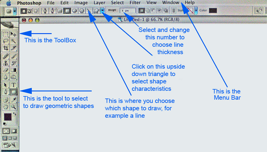
To begin with I started with making many basic designs of what I had in mind, I created these by using Adobe photoshop, a graphic design software. I had ideas of what to do at looking at examples of other real posters and covers and analysing them and finding the conventions and then using these while designing my mock posters and covers. Photoshop is a professional graphic design software, it had many effects you can use, which is why I chose to use it as it would allow for a wide range of products to use. While creating these I watched several tutorials on how to use tools such as, magic wand, filters and distorters. For example I used the magic wand effect to select the Empire title, i then selected the inverse of this and deleted it leaving just the title, I then created the rest of the magazine from this. Before trying to create this I didn't know how to use this tool so it has created my knowledge of photoshop. There were a few other options I could of used to create these, one being paint. Paint is a very basic software with a limited range of tools, however I am fluent in it. However I decided against this as it would lead to a very narrow and amateur finish.


There are several other softwares which have been used but not mentioned such as Prezi, an online Mood board creator, Blogger, the online software which this is on, it is used to write my blog on and also google which I used for research.


Tuesday 23 April 2013

Evaluation Task 3

This is the audience feedback to my trailer. I asked a group of people that are within my target audience to answer questions about my film to find out if they liked it and it was effective.


Monday 22 April 2013

Evaluation Task 2

How the Trailer, Magazine cover and poster compliment each other.


Below is the directors commentary.


Sunday 21 April 2013

Evaluation Task 1

Below are 9 shots that I have selected and screen shotted and inserted below. I have then continued to analyse them and write what I did well and also what I could improve all in relation to does the trailer fit in with the conventions of a trailer and the Horror Genre.


Snapshot One

This is my first screenshot I decided to analyse. In this clip is a shot of the first titles of the trailer. It shows the audience what production company created the trailer in this case it is the production company, Graveyard Productions which I created. The actual animation was designed and created by me using a program called Adobe Flash. This is a beneficial shot as it allows the audience to understand who made it, and if they enjoyed other Graveyard Productions they may be more tempted to watch this trailer and then possibly the film. This adheres to the conventions of a Horror trailer in several ways, the first way in which it adheres is the production company itself. Many Horror films are created by companies that specify in the production of horror films, and like this as you can see from the details in the shot Graveyard Productions, such as the moon, the tombstone or even the font of Graveyard Productions. Therefore the fact that the production company would be likely to create this sort of film in real life is realistic. The second way in which this shot conforms to the conventions of Horror trailers is that most trailers do have the the production companies title at the start to show the audience who created it. The main thing I think that suggests that the film is a horror film is the font and the name. Graveyards are normally sad, scary places, and many horror films do feature them, therefore the name Graveyard productions is very suggestive of a Horror specific company. The font is spooky and looks like it has been scratched onto the screen also very suggestive of a Horror production company.


Snapshot Two


This is the second shot that I have chosen to analyse. In this shot you can see a mid succession shot of a couple of shots where the character is running up some steps in a panic. However the current shot is a match on action shot of him placing his hand on the railing to swing round. The current shot is located on a bridge in what looks like a urban area. This shot isn't specifically related to the conventions of a Horror film however it is relatable the conventions of film trailers in general. Trailers often include small clips of in the case of Horror films non-scary clips, these are often used to either create storyline or create tension. In this case it is being used to create tension, as the character is being chased by the Slenderman and as shown later on in the trailer to cement the audience knowing that it is a Horror film. The character is very typical of Horror films and fits the convention perfectly being a young male who is the main target audience making this character easily relatable to the audience, which may help for them to come and decide to watch the film which would mean that the trailer has been successful in its targets. The costume used is just a basic polo and jeans which is what is expected is expected of someone of this age, I dressed him this way as it is the average way in which people of this age dress. This will also help make the trailer more relatable for the audience. There are no props used in this shot, as nothing would be suitable for this without it looking weird. This helps set up the story nicely, as the later shot of his dead body will help the audience understand that this is the start of the a Horror film, this is a build up killing with not much relevance to the main plot line but this helps drop you into the storyline nicely. I didn't use any after effects on this shot as it would have made it look over the top and unnecessary. 


Snapshot Three


This is the third shot I have chosen to examine and analyse. This shot is a still shot will several movie award selections titles on. This shot is very common in films as it shows the audience that the film has been nominated for several awards, suggesting that it will be worth watching, maybe convincing them to go and see it in the cinemas and or go and buy the DVD. Helping to make the trailer effective, as the target of a trailer is to attract a specific audience and make them want to spend their money in the cinema or on the DVD. Many trailers that have won awards do feature a title like this, so it isn't unconventional for this trailer to feature this sort of award title. The shot is set on a black background with white clear writing on to help it stand out. The font itself is the one set by the Film Festivals which is why the font doesn't fit in with the rest of the titles in my film. The font is very specific as it is textured in a certain way so I had to create a similar font so that when I entered our names it wouldn't stand out. To create this I found an original poster nominating films and actors for these festivals. I then entered it into Photoshop, edited our names into it and put it in our film. I also updated the dates to the correct year being 2013. In the editing I used a fade transition to help the flow from the previous shot to this title to be smooth. I did this to help the trailer flow and easy to watch, if I didn't the transition would be too jumpy. This title also helps to introduce some of the key actors within the film and if an audience member has recognised one of there names then this may make them want to watch the film a bit more if they like the actor. For this shot there is a bit of dialogue in the background. It talks about the storyline, creating tension and fear within the trailer. This method is very common and fits the conventions of Horror films very well being that often a trailer will have some form of narration to give a quick simple overview of the storyline for the audience.


Snapshot Four


This next shot is one I talked about earlier where the character running away at the start is seen dead. Also in the shot is CSI detective who is investigating the dead body. He walks up to the camera and says 'No cameras please', he then continues to continue to cover up the camera with his hand, as if the camera we are filming with is actually a news reporter and is trying to get footage of the crime scene. I like this shot, although the shot was added last minute, it fits in with the plot line well, helping to develop the story in a short time, allowing the audience to become immersed and interested in it enough to want to see even more. The setting of the shot is in a outdoor covered street, with graffiti on the walls, again suggesting that this succession of shots is set in an urban environment. Although this doesn't have a massive effect on the audience, most of them will live in an urban environment allowing them to relate to the characters via the locations. However although it allows the audience to relate more, it is a rather unconventional location for a Horror film to be set in an urban environment as they aren't scary. Horror films are usually set in a remote location where 'no-one can hear you scream'  however I believe that my killer will be more effective in an urban environment as several killings happen and the only location where this would be plausible is an Urban location. It will also help scare our audience as if they walk through a tunnel like this then they will remember this and maybe fear being killed themselves which is the main aim of the Horror genre, to scare its audience. The two costumes that feature in this is the victims clothes which are the same as in snapshot two, however for this shot we ruffled up his hair as if he had been in a struggle and we also took of one of his shoes to also show this. The other costume in this shot is the CSI costume. For this we purchased an overall googles and also some rubber gloves, this is an effective costume as it looks like a CSI. A CSI in a Horror film is also quite unconventional however they can often be seen in Zombie films, so its not unexpected. One prop we used in this isn't extremely visible but behind the CSI is some crime scene tape we put up, this is ultra effective as a small prop like this can help make the shot look professional. In this shot we used a wide shot to help show the location and also everything else in it such as the CSI and also the dead body. This was a good shot type to use as it allowed everything to be seen, if we used a ultra wide shot I think it would have been too big and there would have been too much open space in the shot which would of made it boring. It helps the audience know that it is a Horror film as this sort of opening shot is quite common in some horror films. This introduces the CSI and the dead body however they both don't have key roles in the overall story.


Snapshot Five


This snapshot is of the main character in his house getting ready to go out and report on the killings in his local town. He is tying his shoelace and looks up and a mysterious looking hand closes the door. This shot is actually a point of view shot, it is taken from the view of the Slenderman which is our killer. He is a psychological killer in this which messes with the main characters mind making him almost think that he's going mad and its part of his imagination. A Point of View shot is good as it will help the audience understand the killer from just watching the trailer. The location is within the main characters house being his living room, this is another relatable location being almost everyone who whats the film will have a lounge. There are two costumes used in this shot. The first is the sleeve and hand of the Slenderman, for this I put on a morph suit which is a skin tight overall that covers your whole body and then over the top of this I wore a suit as this is what the slenderman wears. The second of which is the reporters. In this he is wearing a smart t shirt, and trousers, and a barbour jacket, which all can be expected of a News reporter. This is effective as it will help the audience understand that the main character is a reporter. The second thing that will help the audience understand that the main character is a reporter is the title on the bottom half of this shot. The title says 'the reporter that got too involved' this suggests that he gets himself into trouble, allowing the audience to understand that the story will probably revolve around this. For the tittle to help give the trailer a professional look I have used the same font throughout to also help try and create a brand within it. The font is Adobe Garamond Pro in White, I have used this for the poster and for the movie cover swell. Helping to create a professional looking finished project. In the editing we used two cut jumps, we used these as we didn't want to create a divide between the shots as its helping create the story. I think the jump cuts are very successful in doing there job. This shot is a very conventional shot of the Horror genre, this sort of stalking shot can be seen very often as they create tension and fear within the shot and also often portray the character as the Victim making him easy to relate and side with for the audience. One thing I could have changed is putting the title onto a different shot being just a black background as there are several more titles like this throughout the film, however I decided not to as I think it would slow the trailer down too much make it boring for the audience. In conclusion this shot is very conventional of a Horror trailer and will help appeal to the target market very well.


Snapshot Six


This is screenshot six, this shot follows several similar shots where the camera gets closer and closer until this point where its very close. The previous shots were cut up with a black screen and a white title on with heartbeat noise as the soundtrack. These all built tension to this point. This shot is set infant of someones house who the lead character has just interviewed. The child is outside playing with a toy gun. One thing we could of changed about the location is the location itself as it looks very similar to the main characters house. In this the character is wearing just average clothes for a child of this age to wear, I wanted plain clothes to help portray that he isn't special in any way and more predominantly that it could happen to anyone, helping to scare the audience. The only prop we used in this shot is the toy gun, I decided to use a toy as then it is the only plausible way in which someone or something could sneak up on a child without the child noticing. I think the prop helps make the shot and scene more realistic. The camera shot that I used here was a medium shot Point of View shot, I chose to do this as it would show that the child is looking a the camera as if it is a person. I also chose the camera to look down at the child to help him look like a victim. This is very conventional of Horror films to have a shot that looks down on a Victim as it helps the audience to feel sorry for the Victim. In this shot i used some editing, I used the zoom editor, which zooms in on the child. The point of this is to make the POV shot even more realistic such as the person who's view it is is moving towards the boy. I think this is effective as it will really draw everyones attention to the boy. This is conventional of trailers to do this, to either pan or zoom to an object or character of importance to help grab the audiences attention.

Snapshot Seven


This is screenshot seven, In this you see a black background with a white title upon it, the words on it are 'And you won't be seen alive again', the words are written in a white font, to help maximise the ease of reading. I set the writing in the middle of the shot, just to match it to the other titles and help make it look not unnatural, the writing itself I made sure to create it the same as the other titles, for this I used the font Adobe Garamond Pro in White, I think that this font and colour is conventional as the font is in an old fashioned sort of style which I find creepy, the white colouring is also very conventional as it is very clear and easy to read. This title helps set up the story, it tells you that the Slenderman will kill you.  This is also very conventional as this lets you know that the film is a Horror and all Horror films will try and let you know about what type of film it is, which is the way the production company lets you know what genre the film is. The soundtrack for this is heartbeats, in the sequence the heartbeats get progressively quicker, helping to raise tension within the trailer, this raise in tension is good as it will help make the trailer more effective. The heartbeats are also a good way of signalling to the audience that the film is a Horror, as the heartbeat sound effect is often used in horror films. I also used a fade into and out of the shot. I did this to help the trailer run smoothly and easy to watch as I don't want to bore the audience and a smooth transition will make it easy to watch for them. This fade transition is often used in Horror films as it can be used in a creepy way, this means that this transition is conventional for Horror trailers.


Snapshot Eight


This is screenshot eight, being a close up of the Slenderman with his hand outstreched towards the camera. This is the last actual footage of the trailer so I made sure it was a memorable. The shot itself is set in the woods, which the actual film would also finish in. I chose to film this shot in the woods as it is very conventional and would work towards making my trailer successful. Woods are often spooky and a place where killings happen in scary films. The one unconventional thing about this shot is the lighting. Usually to make the shot scarier I would of filmed at night, however the small budget didn't allow us to acquire a light stand which would of lit the shot enough to film at night. This is why we filmed during the day. The costume in this shot is very detailed as it is a close up the upper body of the killer, if the costume looked bad then this would make our trailer unsuccessful as people wouldn't want to see it. But for this we put a lot of effort into the costume to try and create a believable costume of the Slenderman to help appeal to our Art house audience, but make the costume enough distinguishable enough so that the general public can also enjoy it. The original Slenderman was white, however we changed the costume to black as we thought this would be spookier. The costume is very conventional, it isn't over the top to make it unbelievable but it is also original and scary. The shot we used for this was a close up as the suspense builds throughout the rest of the trailer and I wanted this shot to be the climax of it, which is why I chose a close up. This is also a very conventional shot for the final shot of a trailer as it usually is the most memorable shot of the film as the producers want to make sure that the audience remember the killer or the main character so this will often be a close up of the killer or main character. This is a nice ending to the trailer as it doesn't tell you what has happened and it does what all good trailers do and leaves and enigma for the audience so they want to spend their money and go and see the film, the enigma in this case is who is this character? This shot clearly suggests the film being a Horror as it leaves the audience will a final shot of the strange looking killer. While editing for the end of this shot I chose for this shot to zoom in/blur out as the transition. I chose this as I thought it would help bring the film to a scary and unique finish, I also think that this effect gives the effect of the character moving towards you. Overall this finishing shot is very conventional as it leaves the audience with a unique image and a enigma to think about.


Snapshot Nine


This is the last screen shot of the trailer, being the final credits. This title shot shows the name of the film being 'Faded Delusion' and it also informs the audeince of when the film will be released which it says, 'Out this Summer' giving a vague but defined timespan in which the film will be out. I set the writing in the middle of the shot, just to match it to the other titles and help make it look not unnatural, the writing itself I made sure to create it the same as the other titles, for this I used the font Adobe Garamond Pro in White, I think that this font and colour is conventional as the font is in an old fashioned sort of style which I find creepy, the white colouring is also very conventional as it is very clear and easy to read. This is the next shot after the final climaxing shot, so for this I decided to put the title of the film and when it is out as this is the time it will most likely be remembered when placed at the end of the trailer. The title is centred and the bigger font as this is the most important thing to remember, the then the date the film is out is placed underneath so if the audience enjoyed the trailer they can know when to see it. This is very conventional, not just of horror films but trailers in genre to have the title at the end, as if its placed at the start it may be forgotten. However sequels often have the title at the start to help draw in a previous audience. I think this shot is effective as the font looks clean and matches the rest of the writing in the film and is  also laid out well making it memorable which is effective. It also adheres to the conventions of horror films well, helping it to appeal to horror fans.