There are several posters for the Star Wars series, many of them have different purposes and different effects on the audience. Below I will analyse several of the ones I have selected below and state what I like and what I dislike about each one. I am going to do this as once I have finished the analysis I can use what I have learned to help create a successful poster.

The first poster is what I believe to be a fan made poster, in it is the title of the film it represents in the same font and style as that is used in a actual poster. What they have done is very clever and they have used the outline of some of the more famous characters such as Darth Vader and C3PO and instead of using the fill of the actual character they have used the main location of the film and used some distinctive features of the location to help define the character like in the C3PO poster they have used tatooine's two moons as his eyes. The thing I like about this is the ingenuity used.

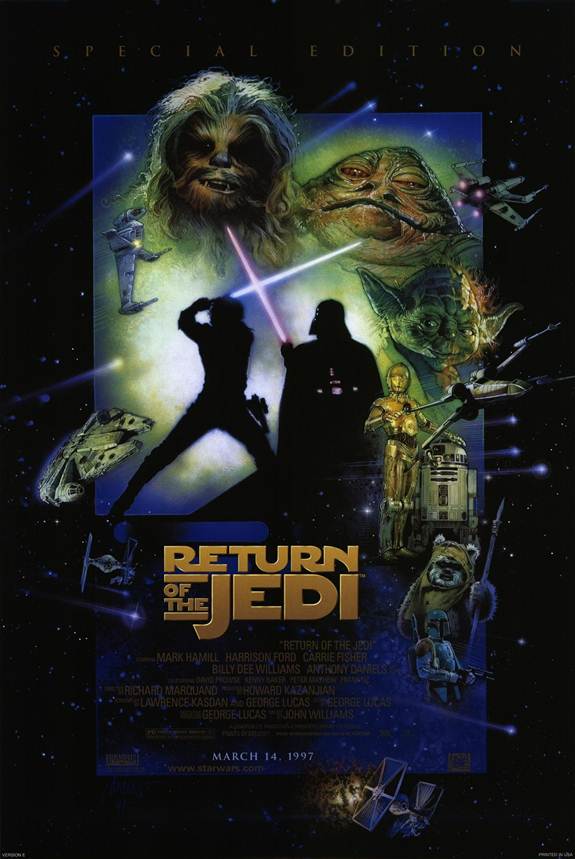


These are some of the original posters that were created for the Star Wars series. They have all been created in a very similar way using the main characters as the main feature of the poster. This is a very special way of creating a poster as usually posters as it shows a basic summary of the film including locations, characters, and even some plot types. This format of poster was first used by Star Wars so when you see a poster like this it reminds you of Star Wars. This is a good way of creating brand identity for the series. As you can see to make sure that the audience understand that these posters are for the same film is by using the same font and styles such as the black border. The thing I like about this is the way they have created a brand identity by using the same fonts and similar styles within the poster. We could possibly use this technique by creating the cover and the poster in the same style to create a brand.


These are the posters for the original Star Wars films, again these are done using the same technique as the posters above, they have been created in the same style. For instance the title is exactly the same, they have done this to help the audience relate this title to Star wars. The posters are for the same films but they released two to help appeal to a larger audience. The poster on the left would possibly target females more as it shows a possible love story, and the poster on the right may appeal to the male audience as it seems to depict a more action Sci-Fi story. This is could be a way to appeal Faded Delusion to a wider audience.


These are some clever posers which I believe have been created by the production company several years after the films were released. I believe that they have been created to help create a buzz to help raise the sales of the DVDs years after release. They are very cleaver posters as they show the audience who have seen the whole series of film the outcome after all the films but it focuses the main of the poster on the film it is trying to sell. I like these posters as they are very clever. I would like to create a poster for Faded Delusion that is this clever.
In conclusion after analysing these posters I have found that there are several things I could use in my poster to help make it successful.
+ Ingenuity, making the poster clever is a good way for the poster to stay in the audiences minds.
+ Using the same style.
+ Professional look
No comments:
Post a Comment