Below I am going to analyse some Harry Potter Posters and what they portray to the audience and if they do there job of advertising the film.
Poster 1

In this first poster, it is very busy but it is like this as it helps let the audence know alot about the film. For this poster they havn't got a picture but it is a good drawing of the charcacters. It also has the castle where the film is set in the background. It includes many of the main charcters including Harry, Hermionie, Ron, Hagrid and Dumbledore. As this was the first film it is a good way of introducing some of the main charcters and locations. The title is 'the magic begins' this suggests to the audeince that if they havn't read the book or seen a trailer that they would know that the film is about magic, this slogan also suggets that there will be other films. In this poster it is very colourful with little shadows, this may be to help target a younger audince. In the poster at the top is a tranquil blue, but lower down the poster the main colours are yellows and red. With hindsight of seeing the film I know that theese are the colours of Gryfindor, maybe subliminaly making the audience side with this house instead of some of the others. The title of the the film, 'Harry Potter and the Sorcerers Stone' is at the bottom of the poster, the Harry Potter part is very big, this is trying to lure in people that have read the books.
Poster 2
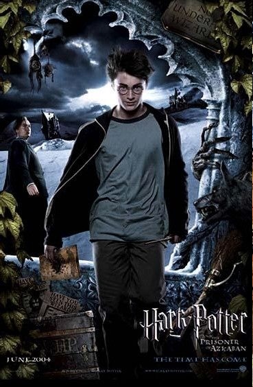
This is the second poster that I have chosen to analyse, this film is titled 'Harry Potter and the Prisoner of Azkaban'. The title is situated in the bottom right hand side of the poster, in a silvery colour. This is still like the first film trying to attract fans of the Harry Potter triology. In this poster it uses a large picture of harry infront of Shrieking shack set in snow. In this poster the big picture is of Harry on his own, compared to older posters in which he is surrounded by other charcters. This suggests that Harry may be or feel isolated in this film. The only other character in the poster is Professor Lupin This could suggest that he is the only charcter in the film that Harry feels a connection with. In the poster there are also some props which are invloved in the film, such as the Mauraders Map. In this poster compared to the first film I analysed this is much darker and suggets that this will go deeper into Harrys troubles. You can't really tell what genre the film is but if you look closely you notice Harry is carrying a Wand which would tell you that it is a Fantasy film.
Poster 3

This is the third and last poster I am analysing and it is quite different to the others I have done. In this the main thing is a Panoramic shot of Hogwarts on fire. This is quite a bold picture as it doesn' t involve anything else except this, there arn't any characters or props that are used. This could be that all the audeinces attention is on the castle. They can do this as it is the seventh film and already has a large fanbase, and instead of attracting an audience it is just making the current fanbase more excited for the film. The picture of Hogwarts burning suggests to the audeince something big will happen such as Harrys possible death. This is also reinforced by the slogan which is 'it all ends here' this suggests that the saga is going to end, this will help attract an old audeince who want to see how it ends. If you look carefully though it is in 2 parts, part 1 and part 2 which will be realsed a year apart, this is a clever way of almost forcing the audeince to go and see 2 films instead of one. From the poster you can't tell that the film is a Fantasy film but it already it has such a large fanbase it doesn't need to advertise its genre. The colours of this poster are either darks such as dark blue or black and reds which helps to show that Hogwarts is on fire. The title of the film is big in the middle of the poster but it is just a short version of saying Harry Potter 7, it doesn't need to full name the film as the current fanbase which they are trying to advertise too already know the trademark font which they have used.
No comments:
Post a Comment