Saturday, 6 April 2013

Possible Poster


This is one possible design for a movie poster for our film Faded Delusion

Friday, 5 April 2013

Basic Faded Delusion Poster

 
Above is a quick production of the movie poster we are thinking of producing, we may analyse and reproduce this poster to create a more professional and conventional poster.

Thursday, 4 April 2013

Star Wars Poster Analysis

There are several posters for the Star Wars series, many of them have different purposes and different effects on the audience. Below I will analyse several of the ones I have selected below and state what I like and what I dislike about each one. I am going to do this as once I have finished the analysis I can use what I have learned to help create a successful poster.


The first poster is what I believe to be a fan made poster, in it is the title of the film it represents in the same font and style as that is used in a actual poster. What they have done is very clever and they have used the outline of some of the more famous characters such as Darth Vader and C3PO and instead of using the fill of the actual character they have used the main location of the film and used some distinctive features of the location to help define the character like in the C3PO poster they have used tatooine's two moons as his eyes. The thing I like about this is the ingenuity used.


These are some of the original posters that were created for the Star Wars series. They have all been created in a very similar way using the main characters as the main feature of the poster. This is a very special way of creating a poster as usually posters as it shows a basic summary of the film including locations, characters, and even some plot types. This format of poster was first used by Star Wars so when you see a poster like this it reminds you of Star Wars. This is a good way of creating brand identity for the series. As you can see to make sure that the audience understand that these posters are for the same film is by using the same font and styles such as the black border. The thing I like about this is the way they have created a brand identity by using the same fonts and similar styles within the poster. We could possibly use this technique by creating the cover and the poster in the same style to create a brand.


These are the posters for the original Star Wars films, again these are done using the same technique as the posters above, they have been created in the same style. For instance the title is exactly the same, they have done this to help the audience relate this title to Star wars. The posters are for the same films but they released two to help appeal to a larger audience. The poster on the left would possibly target females more as it shows a possible love story, and the poster on the right may appeal to the male audience as it seems to depict a more action Sci-Fi story. This is could be a way to appeal Faded Delusion to a wider audience.


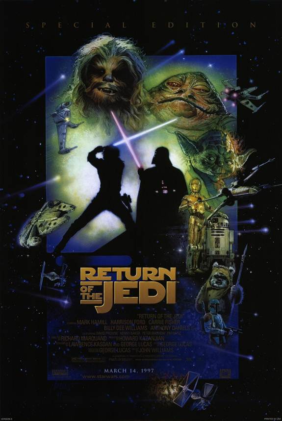
These are some clever posers which I believe have been created by the production company several years after the films were released. I believe that they have been created to help create a buzz to help raise the sales of the DVDs years after release. They are very cleaver posters as they show the audience who have seen the whole series of film the outcome after all the films but it focuses the main of the poster on the film it is trying to sell. I like these posters as they are very clever. I would like to create a poster for Faded Delusion that is this clever.


In conclusion after analysing these posters I have found that there are several things I could use in my poster to help make it successful. 

+ Ingenuity, making the poster clever is a good way for the poster to stay in the audiences minds.
+ Using the same style.
+ Professional look

Tuesday, 26 March 2013

Soundtrack research

To research throughly the soundtrack possibilities I am going to investigate several already used soundtracks within a film and analyse what effects they give the trailer. I will also look into non-copyright music that has been uploaded to the internet that I could use. Then I will also look into producing my own score for the trailer.


Below are 4 trailers ranging from old to brand new, each has a very different type of music for the soundtrack.


The First soundtrack to analyse is that of SAW, although SAW itself isn't a great movie it sticks to the conventions of the previous films very well, this is a great way to bring back fans of the previous SAW films. The music for this trailer is the same used in many of the other SAW trailers and even some of the SAW films. The music itself is very quick, and also uses very dramatic noises and instruments within it. One of the special things about this soundtrack is that it is so recognisable, which is the main USP of this soundtrack. One of the great things it does is build up, it layers very well until it is not just a single layer violin, but a full orchestra. Also on the second drop it uses something very unconventional which is to use the drums in that sort of way, they are played as if cut from a rock song. However within this score I think it works very well as it makes the piece even more distinguishable and unique. In my eyes this soundtrack is very successful due to its individual style that could be a likened to that of a action soundtrack, however it works well within the context to help build the SAW brand.


Although not a Horror film this Soundtrack could not be left out of my analysis. In my eyes it is one of the most successful soundtracks for any film, I think this for several reasons. One of them being its unique and recognisable sound. The intro of the song being the 'duh duh' noise is so well known when played even people who haven't seen the film know where it comes from.


I like the music in this trailer, its very creepy and was very original for the time. Then the music layers and then becomes fast pace with the creepy violin still playing underneath the fast paced drums. I also think another effective technique used in this is the voiceover that explains the basic storyline to the audience. 


This is the trailer for Paranormal activity 4. In this there isn't any music in this, however there are sound effects used throughout to make the atmosphere tense and scary. This is a effective use of sound effects and will help to make the trailer scarier. 


I have looked into creating my own score for the movie as this would be completely uncopyrighted. I have previous experience within a Music production software called GarageBand. I have tried playing around with it to try and create some music that I would my movie. Below is the score I have created that we could possibly use in our Faded Delusion trailer.


These two tracks I created and produced myself for the trailer of Faded Delusion. In both of them I created them to layer to help create tension and make the trailer more scary for the audience. I believe they would be effective in the trailer, however I feel they would be more suited to a action film and possibly and creepier track would be more effective for my Horror film.

Monday, 25 March 2013

Empire Poster Analysis

Below I will analyse several Empire cover photos as I need to create a Empire cover that features my film Faded Delusion. When analysing them I will need to look out for several styles that they use often as when making mine I need it to look like the real thing.


These are the first 2 magazine covers I am going to analyse. I have placed these 2 posters together as I noticed they have some matching traits. These 2 posters both revolve around the 2 main films, Hellboy from Hellboy 2 and Ironman from Ironman 2.
The first thing I noticed was the Empire title in these they have edited the title to match the film, for instance in the Iron man cover the title looks like it has been electrocuted, as Iron man's heart is run on electricity, and its the same for the Hellboy cover, the title is on fire and in the film you see Hellboys true state with long horns and in between there is a ball of fire, he is also meant to be from Hell which is also heavily related to fire. I like this effect that has been used here, I feel that it makes the cover more interesting and may catch more attention than a normal title would, I also feel that the themed title helps make the cover more appealing as a average title may stick out and draw attention away from the more important aspects of the cover.
The second feature of these covers I notice is the small information circles on the cover. They hold key quick snippets of information such as 'Ultimate review of 2009' and 'Sneak preview Click here'. These are both very intriguing and will catch the readers interest and will make them pick up the magazine and most likely buy the magazine so they can benefit from these features.
Another great feature I also like on here is the subtle use of a minor colour scheme, by this I mean the parts of the cover you aren't drawn too, however when you notice them you notice all of them due to the matching colours. For instance in the Hellboy trailer if you look closely you will notice some small gold details such as the quote, 'You and whose Golden army' and the small 'First Look' title and also the gold information circles. I like this as it gives a professional look to the poster.
The fourth point that I like about these two posters is the white writing. A lot of the writing and titles is written in a set font and a white writing. I like this as it is very clear and I think they probably think very  carefully about the background to help the white font stand out even more. I like this as it makes it clear and easy for the possible audience to the read.


There are several things I like about these covers. These are the covers of the Jan 2012 Empire magazine, they are both revolve around the Dark knight Rises release.
The first thing about these I really like is the alternate covers, I think this is an excellent marketing ploy as people who really enjoy Empire and collect them will want to buy both the covers. This is a good way of raising sales of the magazine.
The second thing I like about these covers is the sneak preview into the films, at the time of release the film wasn't out just yet however there was a large amount of above the board and under the board advertisement. It was a surprisingly successful marketing scheme even though it wasn't very conventional, they were very select when choosing what information to release and these in depth costume photos and the weapon that Batman were really interesting to everyone who had an interest in the film.


This Empire poster is for Harry Potter and the Deathly Hallows, this poster I find isn't the most effective  I think I will list the reasons why I don't like it.
The main reason is that I think that there is too much writing on the cover. I feel that the amount of writing on the page clutters it up and when I look at it I find I cannot focus on it very well and I can't pay attention to it very well.
The second thing I don't like about this poster is that there isn't anything interesting about it, Harry Potter is a very run down series and a picture of Daniel Radcliffe isn't enough to keep my attention for long enough.


These 2 posters are very rare of Empire, I had to search quite deeply into the internet to find them, they are very interesting as they are very similar.
The main thing about these covers are the fact they are so plain. All it is is the Empire title found on every Empire cover and a large picture, on the Batman cover it  is the Joker, who is the main evil character. And the Avengers poster on the right is the same as the Batman cover however the Joker picture is replaced with a picture of some of the more well known characters. I think the reason this is so effective is the prior knowledge of the films when the cover was released. The characters involved are so famous and the fan bases for these films are so big that the title of the film is not necessary for a large audience to be attracted to the cover.


In conclusion there are several good points and a few bad points about the covers I have analysed that I can use when creating my Empire cover to make it attractive and effective.

Good points
+ A clever use of effects on the Empire title.
+ The small information circles that explain key pieces of information.
+ A colour scheme for some of the small details.
+ The use of a set white font to give a set professional effect.
+ The release of key information of the film such as characters or plot lines.

Bad point
- Too much writing on one page giving a cluttered look. 

Saturday, 23 March 2013

Remade Trailer - Still not finished

After analysing my trailer I found that there were several things wrong with my trailer, this is a reedited trailer, however it isn't completely finished however it should be done by the end of the week. Below is the semi-finsihed final trailer.


Friday, 22 March 2013

Trailer Analysis

My trailer looks good however, I don't believe it looks professional in several ways. We may decide to film some new clips and enter them into our film. Some of the problems I believe our trailer has are;

Too much like a Short film

Shots are too long

Not enough shot techniques

These are the three main problems I can see when looking at my trailer. Each is bad in its own way, for example. The shot length is sometimes too long, which may cause the audience to loose interest and stop watching due to boredom. The film seems too much like a compressed short film, the problem with this as it makes the trailer confusing for someone who doesn't know the story. This is also bad as it too can lead to a lose of audience concentration. The lack of shot techniques is bad as it strays to far from the conventions of a trailer.

Some ways to improve this would be too;

Cut up longer shots with quick fast paced action shots, for instance a dead body or someone running away from something.

Cutting out some of the shots that give away plot line to create enigmas and also speed up the pace.

Include some new shots which feature clever shot techniques, such as a match on action shot.